Saturday, December 22, 2018

Image if the city: Vinohradska

Vinohradska, is a street I visit the most after the one I live in. There is a specific part of the street that has always fascinated me. A part at the tram stop Radostska. As it is a residential area, it seems to be very fitting that the amount and variety of shops and services on the block should be quite broad. This small quarter accommodates 9 different shops. In a separate building it could become a mini-mall. Such saturation of signboards of various sizes, style and colors lead to a great inconsistency of visual information and aesthetic view of the street. One can find some really old elements of signboards, some cheap design standing together with more contemporary and clean. As the shopping line had concurred the whole part of the street from one road to another, it would make sense to create a homogeneous design for the whole array of places. 

It is known that the extensive amount of choice effects negatively to our will-power and causes stress. Therefore, making the visual information more consistent, can help to establish better citizen experience. I suggest either restore the elements of old design that are still present, for example the board: GARAZE, which is a sign for unexciting place, but visually responds to the aesthetics of 80-90s and can be reused for the rest of the shops. Another option is to destroy everything and make a clean and contemporary design and infrastructure that which will be comfortable for locals.  Such renovation will be beneficial for the street view as Vinohradska is a long and lively street that starts in the center and is normally full of traffic. Thus the street is popular and the street is visible not only by those who live nearby. 


Saturday, December 15, 2018

Mike Hoolbroom's reflection of the imitation

A 10-parts experimental movie 'Imitations of Life' by Mike Hoolboom is a variation on the topic of photo & video representation of our lives, are they able to replace real experiences, do they help to remember or just distract us from the most important moments. The debate had started from Sontags' 'On Photography' and continues to contemporary digital era, when images seem to rule the world. The film is perceived as a demonstration of the authors' personal archive: home videos, commercials, movies than has been extracted from the author's shelf. Experimental art is initially a type of art that is different from traditional. In the extreme understanding of the concept, stand the denial or confrontation with the set laws and rules of production. In order to break them, one has to know them. That is why it is not relevant to call experimental art as something that promotes low standards, is shallow or is simply a nonsense. 


I have chosen the second part of the movie which is called 'Jack'. This part made me think about the idea of 'distracted perception', which is also stressed by some replicas of small Jack and can be better explained by this extract:

“Jack says technology is the knack of arranging the world so that we don’t have to experience it, that the change we call progress is just another obstacle to joy and that stories have no point unless they absorb our terror. Jack tells me life swarms with innocent monsters”

There is no linear narration in this part of the movie, even though the are check-points in a form of special dates mentioned by the narrator. There are characters, but they have no voice. No consistent visual style: monochrome replaced with sepia, than replaced with colours; quality varies from high to grainy and blurry; most-likely, the range of equipment used for the filming was wider than normally is as well. It is possible to trace how the technological progress went on throughout the years of Jack's growing up. Whereas, in the fiction the visual style tends to stay mostly the same throughout the whole piece - trademark, individual style, recognizability. 

In terms of editing, the film demonstrate similarly broad variety of tricks. Probably the most obvious is constantly repeating close-ups. By filming his nephew from a very close distance, the director makes the ties between the narration and the picture even stronger. All the words start to be more intimate and  creates the imaginary door into the life of the boy. However, sometimes it also created some discomfort, as it gets too close and too often. 

Another distinctive feature of the film is that how the author draws parallels between casual moments of child's life with the theoretical knowledge from different spheres, like psychoanalysis, sociology, religion. Its not a typical approach that can be found in fiction: drawing links between sentimental, family moments with some distant and, sometimes unpleasant, concepts, like child's game and apocalypse. By doing this, he creates an illustrative contrast between a new, blooming life and how the camera is able to reproduce it. Such contrast is strengthened by the idea of fragmentation that is present in the short: the episodes of Jack's life are translated with a year gaps - just like the camera is only able to capture random, scarce pieces of the whole. The mere fact that the director had captured some, in his understanding, significant moments, already shows the effect of filtering the reality - we see Jack, but we see him only from the perspective of his uncle. 

Monday, December 3, 2018

Comic hero: One night of Day

The story of creation of my comics started from the idea to base it on my own Instagram stories and to relate it somehow to the topic of social networks, how it changes our communication habits and touches upon other spheres of our lives. I am personally not super active Instagram user, but I love to post stories. That's why I though it would be interesting to base the comics on the stories I have posted. I looked up at them and realized that I had a lot of nigh images, videos of lights and not that much of me there. That's when the idea about light came to my mind. 

From conceptual point of view, I decided to dwell on the idea of privacy of our online identities. Social network profiles are used as tools for identification and construction of identity. It is paradoxical that there can be any amount of privacy in the public account. However, it is truth: we are able to regulate the level of accessibility of others into your life, show merely the sides of our lives that we want to show, and still remain in the shadow. Consequently, balancing on the edge between real and virtual lives becomes a kind of advantageous skill to acquire. 

A couple of words about the comic hero I used as an inspiration - Jessica Jones. She is from Marvel Universe and is somehow connected to the story of Spider-man. What I like about her is that she is very real, even though she has a power of being super-strong and can kick any bad-ass easily. She has been through a lot, but preserved a good heart and humanity in spite of her powers. She is also an image of feminist representation of a women character, without over-exaggeration.  

The comic hero I created is also a girl in a city. She lives her life socially, but undercover. The thing is that no one ever saw her out in the day light, because she never was. There is nothing mysterious or tragic that prevents her to expose herself to the daylight, it is just the way she is. Fortunately, she leads quite normal after-dark existence. Her passion, hobby and job is a collector of rare lights, which is the most suitable type of activity for her lifestyle. However, she doesn’t like the word ‘collector’ and says that it sounds dry as if it excludes the emotional side of the process. When she gets out to hunt, she meets many other night owls, some of them are her regular companions, some of them are just one-night guests. Everybody is glad to see her around, even though her face has an unusual ability to elude from one’s memory quite quickly. This is the weirdest part about that person - she is famous, but unseen. Her  personal Instagram page has around 5k followers, that almost never saw her face...Though everyone knows her name is Day. 

Her day starts normally at 8 pm. Even though it is a reversed schedule, she fills pretty comfortable with it and tries to keep to a typical day routine. She makes herself a nice vegan bowl around 9. It is followed by a cup of coffee with rich amount of coconut cream and listens to  Day lives in the studio flat, partially brick-lined, partially white. Probably there is no another person who loves white color as much as this person. And no other person has ever owned that many white pillows. A remarkable feature of her studio flat - a small closet, which is always closed. At least nobody ever witnessed Day opening it and nobody ever dared to do this without permission.  A short while ago the door of the closet acquired a middle-sized, silver padlock that looks quite old, but is perfectly shiny regardless.

The story of how the locker appeared is trivial, but important is one would like to know what is actually stored in this closet. Of all her possessions, Day has only one think of black colour, not exactly the thing, not exactly she has. So it is/was a Shadow - her cat. Shadow is the one, the one who knows what's in the closet since that summer day when a fat black fly flew into the flat. Driven either by a desire to be the only black spot in the place, or his predator instincts, Shadow started his wild hunt. After a while, being very excited with the process, the cat saw a fly landed on the door handle of the closet. At the next moment he jumped over it, the door opened slightly and...the fly was caught, yes. The only thing is that Day was looking for the Shadow for quite a long time, until she realized that some of her brightest lights was missing. It leaked through the small gap in the doorway...Now she realized - she is probably the only owner of an overexposed cat. Shadow, if it's relevant to call him like that now, was the same perfectly white colour - not  single black dot, including the eyes - that the rest of the flat. Day was surprised about the cat, frustrated about the lost light, as she already found a person to sell it to, but also saw new possibilities. It was a while since she decided to make a Shadow his personal Instagram page. Now it would be just a blast she said: a first, the one and the only page of an over-saturated cat! 'A perfect pet page for a girl with a face-less Instagram page',- she thought and opened the window to let some moonlight in.  


#daysday #lightsarelove #thebrightestlight #shinebright


Tuesday, November 20, 2018

Graphic poem 'The Risk'

Choosing the poem I searched for something short, something deep, but not too corny. I came across the poem 'The risk' by Anaïs Nin by chance. To me it seemed very relevant for some periods in everyone's' life. It talks shortly in a metaphorical for about the necessity of changes, development and the harm of standing still, frozen by fear to move on. The poet associates the process of changes with the process of flower blossoming. Quite a corny metaphor, but, surprisingly, doesn't sound that bad in this poem. However, compared to flower, the similar process can be repeated multiple times by the same person in the same situation.  

And then the day came,when the riskto remain tight in a bud was more painful than the risk it took to blossom.


Because the verse symbolizes a process, I decided to make an appropriate visualization: a GIF animation. The main feature of GIF format is that it is looped, that is relevant for the concept of constant development, blossoming as many time as you can. The GIF consists of two words 'blossom' and 'bud' that form an image of flower. The flower is hardly can be seen fully - the sign of permanent nature of the development process. 


                                                                  https://gph.is/2R49I2I


Friday, October 26, 2018

Analyzing communication codes in a movie: 'Coffee & Cigarettes'


‘Coffee and Cigarettes’ by Jim Jarmush

‘Coffee and cigarettes’ – an anthology film by an American director Jim Jarmush, released in 2004. In his movies, Jarmush widely discusses the topic of existentialism and this one is not an exception.  The movie consists of 11 shorts that are based on the dialogs of the people specifically accompanied by a cup, or several cups, of coffee and cigarettes. There are some common threads between the scenes, such as topics, references and ideas. The concept of the movies was based on the original short ‘Coffee and cigarettes’ that was released in 1986.


The film is a curious example of experimental movie, both in visual and conceptual senses. It has a variety of director’s tricks and visual codes that follow one major aim – to demonstrate how any moment of communication can be precious, no matter what emotional coloring prevails. As to the limited timing, short films are directed quite precisely and have to incorporate multiple visual codes in order to convey more information in shorter time.

One visual feature of the movie that the viewer notices almost immediately is that the movie is monochrome. Such approach was, possibly, taken in order to connect all the stories and give the whole piece an aesthetics of documentary format. Such choice can also stand in a parallel with the title of the movie itself, as coffee is always black and the cigarettes are always white. Another visual element that is constantly repeated throughout the shorts is a chess board. The element goes in parallel with the dialogs: participants have to make the polemic action in order to move on with the verbal game.  Another possible meaning that a chess board might carry is a symbol of choice. The protagonists of different stories frequently discuss harmful consequences of coffee and cigarettes, yet the choices they make are normally in favor of their bad habits.  

All the 11 scenes from each short are constructed similarly. At the beginning, there is one wide shot, some single shots in the middle and closing shot from over the table. Closer, portrait shots are made in order to emphasize the micro movements a character does, just to clarify what kind of feelings are present in the situation. The shots play a role of symbolic visual codes and give more insight to the viewer.

The over the table shots usually show some similar picture: coffee cups, ashtrays and chess-board pattern. Besides of pointing out some interesting objects and their location on the table, such shots add to the disclosure of personal characteristics of the participants. For example, in the scene with Iggy Pop and Tom Waits, the protagonists are having quite an argumentative dialog. Iggy stays more calm while Tom is shown as a more aggressive and pretentious type. At the end of the scene we see the top shot which shows that Iggy’s cup was full and Tom’s  – empty. That associative thread is used not only in order to show the opposite stance of the two, but to underline their mood and temperament.

In the movie, the depiction of characters does not focus on relationships between sexes and does not recall to some stereotypical images of both men and women, at least, not for the sake of discussion of their representation. At the same time, there are considerably more male characters than female. This might be due to the topic and stylistics of the movie. Empty, not quite cozy café’s, lots of smoke and existential hue of all that could be seen as more suitable to incorporate male personages. Nevertheless, there is a strong element of power play between the protagonists in the scenes. The viewer can easily spot either some emotional background that makes the characters play these games, or some misunderstandings that are happening during the scene.


It’s remarkable that one of essential emotional elements of any movie – anticipation – is missed in the ‘C&C’ selection of shorts. The viewer might not get the satisfaction of fulfilled expectations here. On the contrary, the dialogs normally end up with some kind of argument. The largest emotional value here is given to the small situations that happen between people. Jarmush tries to put these easily overlookable moments of interaction in the focus of attention. Such voyeuristic approach is implemented in order to demonstrate the beauty of those small-talks, even if they are not very peaceful and harmonious.  

Another emotional component of the directors work is the usage of music. Music is also discussed in some of the shots and is one of the main topics. 

There are a couple of things that add vastly to the naturalness of the scenes. According to Jarmush, some of the dialogs and lines were improvised by the actors. Some of them, though, were taken from real-life situations and incorporated by the director. One more feature that promotes more emotional connection is that all the personages carry the names of the actors or musicians who play them. Thus, the actors are playing themselves, even though they are not really themselves, but some playful, sometimes exaggerated versions of them.

The genre of experimental movie implies breaking standard convention of the more or less established film-making patterns. By means of doing this, the directors are able to explore more innovative techniques to implement the ideas that had been widely discussed before. ‘Coffee and Cigarettes’ is an example of how non-standard technical and conceptual approach to character design can create an non-cliché perspective on such frequently referred to topic as existentialism.


Tuesday, October 23, 2018

Changing the context of images: combining 2 advertisements into a new one

Advertisement is a type of media that relies heavily on visual material and strategies of meaning encoding. A good advertisement, however, has to incorporating various visual codes in such a way, they can be easily and quickly decoded by those who will see them. Ideally, the codes have to be familiar to people on subconscious level. The details have to be harmoniously combined into one clear message. Nevertheless, can the images from one ad work as successfully if put in a different context? 

For the assignment I have chosen two contemporary printed advertisements and, by combining them together, will try to create new message. I have decided at the beginning that one of the advertisements of my choice have to be textual. I started my search from picking up the one with bare text. I have several options for that. The text had to be either quite general or just not very specific (without telling exactly what is advertised). Visually, there are a bunch of textual ads that use messenger stylistics, as if you are peeking in somebodies chat. I liked the idea of creating this kind of more personal approach in a new ad. Such openness can subconsciously make people to make associative bond with the message. After a while my choice stopped on this one :


This is an advertisement by Volkswagen, which has social coloring: warns about the danger of texting while at the wheel. I found the text quite sensitive. The authors tried to create a parallel between words trauma and the act of driving by implementing another signifier of driving - a word 'traffic'. The phrase 'Please don't drive' make the picture a whole one. However, while the text is separated from the rest of the elements, it becomes more neutral. So, the next step was to find a suitable image that can alter the meaning of the text. Needless to say, that the word 'trauma' by itself connotes something negative. According to the dictionary, trauma has two possible meanings:

1. (Psychol)   a powerful shock that may have long-lasting effects
2. (Pathol)   any bodily injury or wound  

Consequently, in order to detach the word from it's meaning in Volkswagen ad, I decided it'll be more useful to treat 'trauma' according to it's first dictionary meaning. I started to search for a suitable combination. And found this Starbucks ad:


And found this Starbucks ad: It;s interesting that this one has also some word that carries negative connotation 'painful'. The eye actually looks as it's owner is shocked or suffering a bit. After removing the eye part from the rest, it could be detached from the concept of waking up and be interpreted like 'open your eyes' in a metaphorical sense. Thus, I had to combine the idea of traumatic experience with the concept of blindness to something. That is how the idea about another social advertisement appeared. After combining the two images in Photoshop, I got this one:


The new advertisement connotes such issues as depression and any other traumatic experience that people are ashamed to uncover. This issues are spread around people of various ages and can lead to suicidal behavior. The new ad stresses out the word trauma and implied that the person who writes the text will probably pick up the word 'traffic'. I have added the red-line element in order to stress out the importance of the issue, draw more attention by adding some more dramatic impression. It is aimed to raise awareness of people to take care and be attentive to others, open their eyes in case of some signals occur and offer help. 


ICON/INDEX/SYMBOL


E M P A T H Y

ICON
I

INDEX


SYMBOL


Monday, October 15, 2018

Memories embodied: reviewing and remaking a sculpture of choice

Remaking, criticizing and re-contextualizing someone else's art is not the most easy thing to do. At least because the way we perceive an artwork is built upon our own background, perspectives on the topic and on the ways to approach it. Therefore, for this blog entry, I decided to pick up an example of  a monument that, subjectively, is a highly questionable realization of an idea. That monument was my long-term pain, as it is located in my home-city - Odessa -  I used to pass it by numerous times and still never got used to it. The artwork is a memorial to Steve Jobs which commemorated the first anniversary of his death and opened to public in 2012.  The project was commissioned by the city council and designed by young Ukrainian sculptor Kirill Maksimenko. Yet it is unclear why exactly was the monument dedicated to the person who had never visited Odessa and has no direct connection to the city.


The sculpture consists of several strong visual and conceptual elements, that, however, either do not correlate with the concept or with each other. Let's start by considering, the primary figurative element of the sculpture - the figure of a hand. The author comments this choice as it was a reference to Job's manner of active gesticulation during his public talks. The act of gesticulating itself is quite a frequently occurring thing during performances and talks in front of the audience. The offered association thread of the gesture act and the person is so slight that a stronger signifier had to be added. Here, on the contrary, we have a sign that has inseparable strong bound with the persona of Steve Jobs - the apple-shaped logo. Somehow the connection has been established. However, nowadays the logo of the most globally acknowledged corporation implemented into a work of art acquires a form of kitchy symbol of technological innovations and consumerism, rather than remind people about a mastermind behind Apple corporation. The Apple sign is cut through the middle of the hand, which establishes an even stronger connection between two objects.

The choice of material is also a bit controversial. Maksimenko specializes on the metal-recycling in his sculpting. That means the materials for the monument consist of auto/moto parts and industrial metal waste. Such choice of materials in this case, even though it is the sculptor's specialization, is questionable. Steve Jobs was definitely a person who strived to the progress, technological innovations and broadening the horizons of design. The material has nothing to do with those characteristics of the honored persona.

Those are the basic features of the sculpture that I would like to re-make in my project. I would like to start with a different choice of a basic shape. Because there are hardly any abstract sculptures in Odessa, I would suggest to have something non-figurative. Here we can turn to the story of Steve Jobs and remember one of the most significant innovations he popularized - touch screen. For the material I would suggest to make it of some industrial plastic/acrylic. The dark semi -transparent 'screen' will be a layered wall of rectangular shaped blocks. The surface of the sculptures will be covered with sensors that react on touch by producing some soft light. Such detail emphasizes both the concept of touch screen and amazing personal abilities of Jobs to connect and communicate. This is a rough draft of the possible sculpture project.


Since the sculpture is planned like an interactive one, the location for it should respond to this feature.  The size of the sculpture will stay relatively similar to the old version: 1.60 heigh, 150 -width. Therefore, the best place for mounting the work will be the one where the audience can freely interact with it. Undoubtedly, it has to be mounted in a lively or ,at least, in a walk-through place.

Digital version of the sketch:


Wednesday, October 10, 2018

Deeper into the meanings: semiotic analysis of an advertisement

Semiotics - a science about signs, is based on the ability of human to get the information about the world by recognizing and interpreting various signs. Semiotics deals with investigation of how the meanings are created, initially in language and textual format. The major principles of Semiotics were introduced by Ferdinand de Saussure in terms of linguistics. He proposed the perspective on language as at the structured system of signs and meanings. This groundbreaking principle became a pillar for structuralism theory, that considered underlying structures that helped to define the world within social and cultural spheres.

When it comes to meanings and their construction, the concepts of connotation and denotation have to be introduced. Roland Barthes, who proposed these idea of the meaning is being constructed on two levels - connotative and denotative. The two concepts are fundamental for semiotic analysis. The first level is denotation - the most easily identifiable part of the sign (physical form). Whereas connotation represents the attached meanings  of the denotation. For example, White House, which denotes a building, a residence of the U.S. president, can connote such concepts as power and wealth. While the combination of the two levels is strong and spread enough, it can result in the formation of another scope of signification - myth. According to Barthes, myth is a signifying system which is built upon the previously existing semiotic sequence. When the denotative meaning has a connotative meaning attached to it by means of associative chains, the myth is formed. Myth can be successfully applied in terms of analyzing cultural and social phenomena, such as advertising.

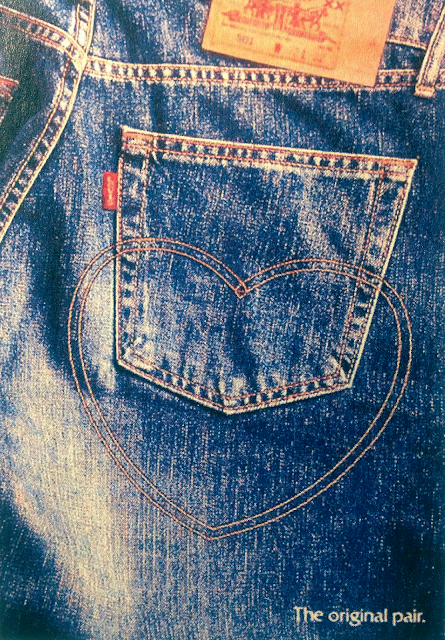
For demonstration of basic semiotic analyses I have chosen an old advertisement of Levi's jeans. 


The whole advertisement is a photograph of the back pocket of a pair of classic-blue Levi's jeans. A standard pocket stitching pattern is formed into a heart - shaped ornament. Obviously, this advert, as most of them, serves as a means of certain correlation between the promoted product and certain emotional coloring. In this particular case, the aim of the creators is to establish associative connection between a pair of Levi's jeans and such emotional concepts as love and caring. On denotative level, a sign 'heart' is immediately spotted.  The sign connotes positive associations with feelings of affection, love and attachment. Another significant detail here is the way the heart is fitting into the pair of jeans. Firstly, one part of classic Levi's style stitching is becoming the upper part of the heart. Secondly, the heart is tightly stitched into the textile. Both this denotative details are responsible for creating a strong bond between the brand and positive feeling of love. 

Another denotative element here is a piece of text: 'The original pair'. It's apparent that the prior importance here is given to the word 'pair'. The denoted word can have two meanings: one that is directly related to the product itself - a pair of jeans; and one that refers to the idea of romantic relationship. Such connotative coincidence results in even stronger associations can be created between the product and the concept. Therefore, if taking in account connotative side of the image, the myth behind it can sound somehow like that: Our product is made with caring about you and you are going to fall in love with it. While the myth has been determined, it's possible to outline the Syntagmatic and paradigmatic elements of the image. Syntagmatic, those that can be changed without the altering the initial meaning - can be those like color of  stitches, typeface or size of the text and the model of jeans. Whilst, paradigmatic - those that are of significance for the construction of the desired meaning: the shape of the stitched into element - heart - could not be changed for a star for example. 

The analysis demonstrates how the principles of semiotics can be used in deconstruction of the visual messages that are encrypted in advertisements and other kinds of visual-based media. 

Questioning the relevance of color of jeans as of syntagmatic sign. 

Sunday, October 7, 2018

Representational analysis: 3D space as a reflection on contemporary world

For demonstration of representational analysis I have chosen an artwork which is a comment on contemporary lifestyle in a world over-saturated with media. The artwork is an interactive 3D space that the world of verbal and audio messages that we consume on a daily basis. The space itself is a dark circle with reflective wall, lit merely by the neon words and signs floating in the air. The selection of words was taken from the lists of those mostly met in media during the 2017. On intention, the space was made as disturbing as it was possible, by giving it a constant 'white noise' background, adding extra sensitivity to the camera movement (1-st person perspective) and enhancing the brightness of visual elements. Here are some still shots of the space.


Interpreting the artwork, as a form of representation, will be divided into 3 parts: technological side, economical side, political/social side. Initially, the goal was to make a comment, rather than criticize conditions of modern lifestyle. Therefore, the message of the artwork was derived from the widely known social and political and, sometimes, economical contexts. For example, a work 'bitcoin' or the phrase 'fake news' definitely refer to some events and phenomena that was an agenda during the year and were widely discussed. 

From the point of view of economical impact, a hint of critic can also be found here. Neon adverts and signs are very much associated with strongly attracting one's attention to something, presumably, with an aim to sell it. Wrapping the words into this visual context can be taken as an ironic comment on the idea of information being spread with a purpose of receiving some economical profit. Finally, the strongest impact here takes place on technological level, as technologies are responsible for global information coverage and individual targeting of people, groups and countries. Social networks like Facebook, Tweeter, etc.  not only let people receive this information, but also create an ability for them to respond, discuss and become a part of a new public sphere. On another level, the artwork itself was a comment that could not be implemented in life without certain technologies. Besides the hard/software that was used,  the Internet supplied me with all the words and phrases for the fulfillment of my idea. Thus, the production of the artwork becomes itself a demonstration of it's conceptual goals.